Street Address
Cleveland, Ohio
216-571-2219
Graphic Design + MArketing professional
Graphic Design + MArketing professional
+Art Direction +Event Logo Design
Collaboration with event coordinators and committees helping to develop various event logos that coordinate and compliment UH’s logo and brand guidelines.
+Comprehensive Event Collateral
In addition to designing various event logos and invitation sets – thoughtful complimenting event collateral such as social media/email graphics, sponsorship booklets, programs, pop-up banners, and follow-up materials are also developed.
+Logo Design +Masthead Design +Publication Design
‘BeCause’ a 24-page donor + community publication distributed by The Parma Hospital Health Care Foundation is given an updated look while still appealing to an older demographic. Larger graphics are incorporated in a pleasing color palette, with stories made shorter with larger type and featuring more imagery – resulting in a modernized, yet easy to read publication.
+Logo Design +Art Direction + Illustration + Information Design +Collateral Design +Email Marketing Campaigns +Event Design
Fun yet informational graphics are created with a modern, punchy flair that adheres to brand standards while also being eye-catching. The look is further applied to create handouts for the public regarding the hospital's policy for staff vaccine non-compliance. The campaign successfully increased employee compliance by 30% compared to the previous year – achieving the lofty goal of elevating employee flu vaccine awareness and compliance.
Logo + Branding> Working with a 10-panel committee – HealthiHer, a women's health + wellness program’s logo is developed. The logo pairs a wellness-oriented feel with touches of femininity, while adhering to existing Parma Hospital brand standards.
Print + Digital Collateral> Comprehensive support materials are designed including ads, brochures, direct mailers, and promo items. Vibrant pops of corals and pinks combine with contemporary photography to complement the HealthiHer brand identity across marketing materials.
Email Marketing> A monthly email newsletter is developed + designed to inform members about health news and trends; upcoming HealthiHer events – while also promoting membership benefits. The e-newsletter has steady above average open rates at 50.4%+ (industry average is 22.7%). Membership increases by 55% in a 6-month period through a strategic cross-promotional media plan.
Event Collateral Design > A vivid and distinctive look is designed to promote the Parma Hospital Hermes 5k Race Series while increasing awareness and participation.
Email Marketing > A series of print and online ads incorporating the distinct look and feel are designed to promote the event – enticing runners and non-runners to put their athletic shoes on and raise money for the community. And crossing the finish line… the events raise over $7,000 for the community.
+Logo Design +Branding Development +Website Design +Email Marketing +Event Collateral Design
Paying homage to the original early 1900s brewery and celebrating the modern 21st century revival the FCB logo is born. Fusing traditionalism and modernism the logo’s typography is thoughtfully balanced with serif and sans serif fonts. Double hitter – the "O" is created with a versatile hop icon relevant to the brewery’s mission while also serving as an independent branding icon. Vibrant green is utilized to represent the sustainability practices and hop plant color while complementing the classic black background.
In response to COVID-19, the brewery started canning some of their handcrafted brews. A distinctive yet coordinating label is designed for the top three selling brews.
Developed to be used at promotional events –highlighting the brewery’s hours, services and location.
Starting from scratch – content is created, a site plan is developed and finally a responsive design is implemented. The result – www.forestcitybrewery.com is an organized and attractive website appealing to new and repeat visitors.
A monthly e-newsletter is designed to highlight new beers, upcoming events and engage customers. A steady opening rate of 40% during the first year is noted, compared to the industry average of 20%. Average click rates are 10% compared to the industry average of 2%.
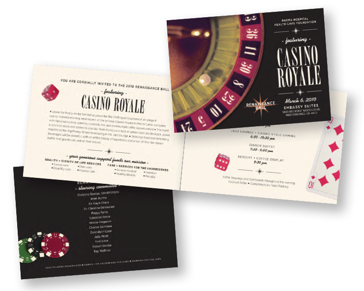
+Event Design +Logo Design +Branding +Collateral Design +Art Direction
Created for the Parma Hospital Health Care Foundation’s annual charitable event, a striking invitation and collateral set is designed. Guests enjoy fine cuisine, cocktails, entertainment and casino-style gaming – an event fit for James Bond.
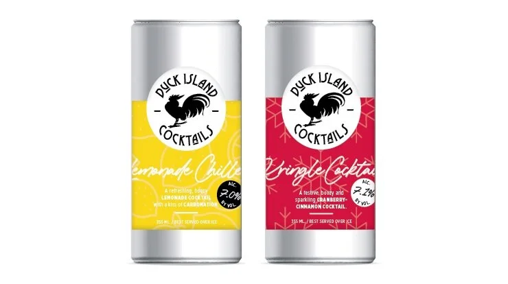
+Logo Design +Label Design
A strong, bold visual presence is created for Ohio's first and only kegged cocktail production facility.
Punchy + playful coordinating labels are created for Duck Island Cocktails first ever canned cocktail product. The Sangria beverage line features Red Sangria, Peach Sangria and seasonal Pumpkin Spice Sangria.
Additional labels are created to coordinate with the Sangria canned cocktails series. Lemonade Chiller for those hot summer days on the porch and Kringle Cocktail for those holiday festivities around the tree.
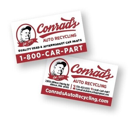
+Logo Design +Website Development & Design +Business Card Design +Promotional Collateral Design +Branding
Conrad’s – a small NE Ohio business that has sold used auto parts since 1977 – has never had an ‘official’ logo. A fresh, distinctive logo design is the first step in getting this family owned business into the 21st century marketing realm. A logo is developed that pays homage to the original owner, utilizing his photo, his favorite color and a dynamic script font.
What’s the first thing this snazzy new logo needs to go on? Business cards – which see a lot of distribution in the used car parts biz. A punchy two-sided card is designed.
The next thing this new logo needs to go on, a website. In the past, a one page static site represented Conrad’s online. A functional, modern and responsive website is developed and designed helping the business step into the online world of used car part finding and buying. It is a success – in a 6 month period, sales are up 40%.
A promotional calendar is created using actual customers’ cars. The calendar paired with cut out car sugar cookies is given to customers and vendors during the holidays. Proving to be pretty popular – the calendar is reprinted 2 additional times.
‘Wreck the Halls’… a snazzy little holiday card is designed to bring on the seasonal cheer while also give customers and vendors that practical calendar once again that they like so much.
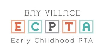
+Logo +Branding +Website Design
Publicity +Collateral +Art Direction
+Social Media +Event Design
Representing the mission of the organization while appealing to parents – a new PTA logo is developed. A modern yet playful look is achieved: Classic ABC blocks that kids love playing with (and parents love picking up) are paired with a fresh color palette along with a playful, yet clean typeface.
A new website that is modern and engaging is developed, while also being easy to navigate and responsive. It is built using a web-based platform that allows multiple members the ease of making edits. A sweet result: a 40% cost savings is achieved by restructuring the budget and selecting a new hosting service and email provider.
Events materials – from social media graphics to signage – is given a fresh, updated look using the new logo and brand guidelines. A 50% increase is noted in new member attendance at the annual Open House compared to previous years.
+Icon Development & Design +Collateral Design
A vibrant + confident collateral piece is designed for Momenteam as a tool for clients to share and keep for reference. Stylized icons are developed to support connection tool kit categories. Eye catching road signs are designed to help convey the acronym ‘OSCR’, a powerful tool for sharing winning stories.
A feedback form is developed utilizing the new icons to facilitate participants’ opinions on the program. The icons helped simplify and organize the content.
Logo + Branding + Art Direction + Collateral + Event Design
An logo with an artistic sense and flair is developed and designed to brand “Arts at the Center” – an annual fundraising event for the Parma Hospital Auxiliary.
The evening reception ‘Masquerade’ is a fundraising event to support Arts at the Center, juried arts event supporting the Parma Hospital Auxiliary. The goal is to increase attendance as the proceeds help fund community health and wellness initiatives.
The concept and design for the ‘Masquerade’ invitation balances striking visuals and vibrant typography. This eye-catching appeal aims to create a festive mood while piquing interest in participation.
The Masquerade event helped raise over $8,000 for community health and wellness.
Coordinating collateral such as tickets and judging templates are designed to carry on the theme and unify the event’s look and feel.